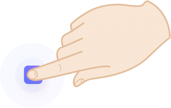
A button is an interactive element that results in the action described on it. It is also one of the most important interaction elements of any digital product.
It can perform purchases, downloads, submissions among other important actions. Digital buttons are also as important as the design of real-world buttons, such as a TV remote control, record player or game console.
The most important thing you should know is that a button should look like a button, and one of the most important rules of designing it is to make it stand out enough not to be confused with anything else.
You are used to certain forms and forms that are normally associated with an action. The better our button resembles the element we associate with the buttons. Therefore, a rectangle (or a rounded rectangle) is always the safest choice for a button.
Other shapes and forms (triangles, circles, etc.) are not user-recognizable. Proceed carefully and use them only if the overall style of your product requires a deviation from the norm.
When designing buttons, consider each item and choose wisely. Using which company's brand or style guide as the basis, select which buttons match the brand and exactly match the interface.
You must set the fill and secure area using the grid base numbers. In the above example, the left inner space is twice as large as the vertical space, which is a safe ratio choice for greater readability.
Irregularly spaced buttons are one of the most common problems with interfaces. Double-check that your button labels are centered both horizontally and vertically. If you need to be sure, create guides.
In addition to grid-based methods, a safe way to select a range of buttons with uppercase “W bilir can be created. If at least one “W” fits on both sides of the button label, you are on the correct path. On the sides, it is even better to use twice the "W" rule for greater readability.
Remember the safe area or space between your buttons. If you have more than one button, the secure area must be separate for each.
Both web and mobile buttons must also have the correct minimum size. If your buttons are too small, it will be difficult to touch or click on them. This causes difficulty and may cause users to uninstall your application. The best way is to start with 44 x 44 pixels for all interactive elements on mobile devices.
Cursor-based devices should also work at 32x32 pixels. Note that the larger the button, the easier it is to use it even on desktop computers.
Important buttons also work well with icons. Payment is quickly identified by a basket or shopping cart icon, but only as long as the word “payment görün appears.
The right arrow or square brackets placed behind the button label makes the message stronger. The user is forced to click and continue.
Shaded buttons are also more “clickable” and noticeably faster than flat ones. Add a subtle shadow to the button to get more out of the background.
Rounded buttons are considered more intimate and positive than sharp edges. At the same time, they make it much more difficult to design content around them. If you have left-aligned text just above the button, the more rounded the corner, the less visually the text will fit - the left margin makes you feel like two places at the same time.